Encouraging habit with personalised news
B2Cpersonalisationengagement
Role & Company
I lead the product design and discovery in collaboration with Anna Lisinski and Mark Limb at the Financial TimesSummary
Shortcuts help FT readers stay up to date on topics related to their work, investments and interests. Today, people who use Shortcuts visit the app 39% more often and use a Shortcut 1 in every 2 visits.
Methods
Generative Research Interviews
Surveys
Competitor Analysis
Heuristic Evaluation
Empathy Mapping
How Might We’s
Customer Letters
Ideation Workshops
Paper Prototyping
Concept Testing
Prototyping
User Testing
UI Design
User need
FT readers need to stay up to date on topics related to their work, investments and interests.
Business Problem
People were not using myFT on the app, the feature designed to meet the same user need as Shortcuts.
Research
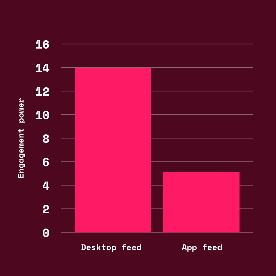
Analysis showed that only 7% of subscribers were visiting myFT habitually. Furthermore, the desktop version was 3 times more engaging than the app equivalent.
![]()
![]() Subscribers had also fedback problems with the feed, stating:
Subscribers had also fedback problems with the feed, stating:
“It’s confusing - articles should be sorted by topic”
“It’s hard to find my topics. It was much easier in the old myFT”
I conducted a heuristic evaluation of myFT on the app and found the experience was lacking in ‘User control’ and ‘emotional resonance’.
![]()

“It’s confusing - articles should be sorted by topic”
“It’s hard to find my topics. It was much easier in the old myFT”
I conducted a heuristic evaluation of myFT on the app and found the experience was lacking in ‘User control’ and ‘emotional resonance’.

Workshops
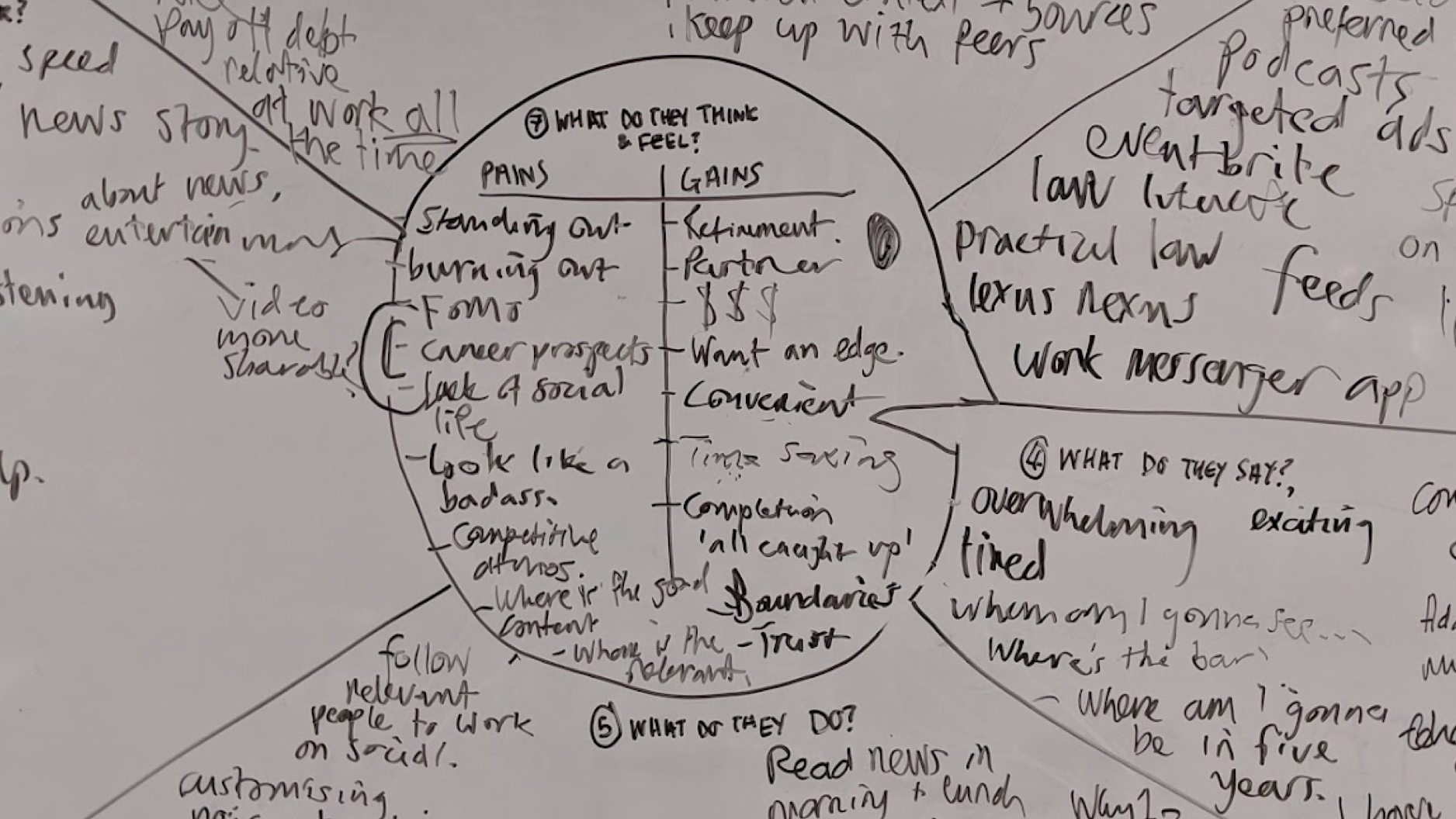
I ran a workshop with the goal of creating a habit forming way for people to discover content relevant to their interests and needs.
We used exercises like empathy mapping, ‘before and after’ vision alignment, and ‘how might we?’ questions to come up with ideas and voted on our favourites - 2 more obvious and 1 wildcard.
In a second workshop we wrote a customer letter, pretending to be a future customer praising the work our team had done.


Wireframes and user testing
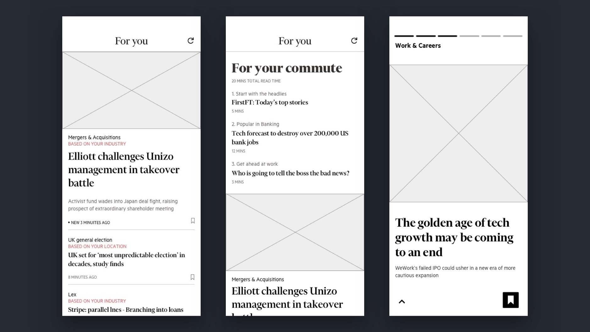
I designed wireframes based on our 3 favourite ideas:
![]()
We interviewed 6 myFT users about them with the help of Fraser, our researcher. To our surprise, the wild card ‘visual feed’ was unanimously the favourite.
We did 2 more rounds of iteration and user testing to further validate the idea.
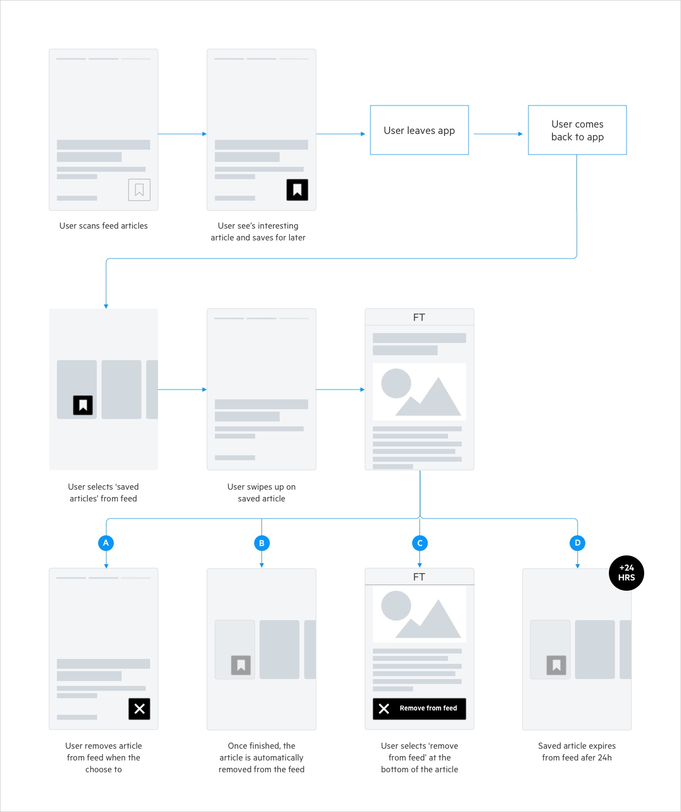
![Exploring a save article journey that was deprioritised for MVP after user testing]()
- The current feed, but better
Sorting the feed by topic and adding article recommendations
- Context based packaging
Packaging articles by context, like commuting or the weekend
- Visual feed
Adapting the ‘stories’ format common in social media to showcase fresh and relevant stories.
We interviewed 6 myFT users about them with the help of Fraser, our researcher. To our surprise, the wild card ‘visual feed’ was unanimously the favourite.
We did 2 more rounds of iteration and user testing to further validate the idea.
Pivot
Over the course of user testing readers liked aspects of the social media story format but felt it wasn’t useful to be presented 1 story at a time. Often, they expected the bubble to go to a simple list. We tried this in the final round of testing and it was preferred.
“I’d expect to see list of stories on the topic”
“Its quite helpful to see the article headlines in the context of other articles - That’s why the list works better”
“Even though I use Instagram, for the FT I think [the list] works better”
![Before pivot - 'Social Media']()
![After pivot - 'List']()
“I’d expect to see list of stories on the topic”
“Its quite helpful to see the article headlines in the context of other articles - That’s why the list works better”
“Even though I use Instagram, for the FT I think [the list] works better”


Experiment
Given the unexpected direction user testing had taken us in, both our team and it’s stakeholders were conscious of such a bold move considering the solutions prominence on the homepage. We decided to release an MVP as an experiment in the app, allowing a small group of readers to try it, giving us an opportunity to collect usage data and get more feedback.
Feedback and itterations
The data, although far from gaining significance due to the number of readers using it, showed it to be 8 times more habit forming than the myFT feed, giving us the confidence to release an A/B test.
Feedback from our in app survey was mostly positive, although it’s similarities to Instagram were not unnoticed, with one user summing it up:
‘I can’t believe the FT is trying to become Instagram!’
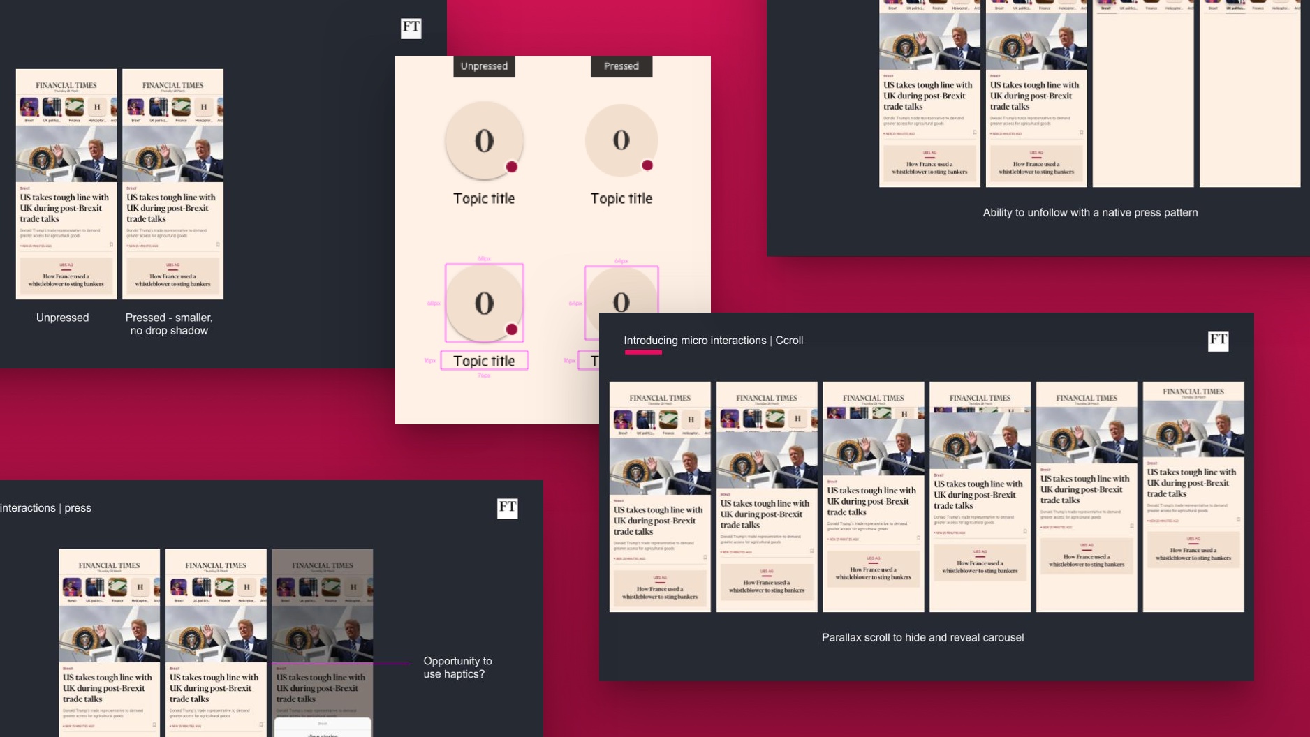
I worked with Mark, a fellow designer, to differentiate the interface from Instagram’s and make it feel like a more integrated and considered FT experience, as well as introduce some helpful microinteractions.
Feedback from our in app survey was mostly positive, although it’s similarities to Instagram were not unnoticed, with one user summing it up:
‘I can’t believe the FT is trying to become Instagram!’
I worked with Mark, a fellow designer, to differentiate the interface from Instagram’s and make it feel like a more integrated and considered FT experience, as well as introduce some helpful microinteractions.


A/B test
We released Shortcuts to 50% of subscribers as an A/B test.
As a result, Shortcuts were rolled out to 100% of users. It has since been launched on desktop too.
- Those exposed to Shortcuts visited the App 39% more frequently than those not exposed
- The shorcuts were interacted with in almost 1 in 2 visits per user.
- The shortcuts also lead users to view more content.
As a result, Shortcuts were rolled out to 100% of users. It has since been launched on desktop too.
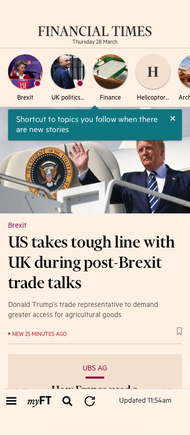
Oboarding
The onboarding interaction on the left was the preferred experience, but was deemed too technically challenging and expensive to build for the test. Instead, we compromised with a simple tooltip (right)
![]()
![]()
Further reading
How our experiment is changing the look of personalised news
Me, FT Product & Technology Medium blog, 2019
How we improved reader habit by 39%
Anna Lisinski, FT Product & Technology Medium blog, 2020
Me, FT Product & Technology Medium blog, 2019
How we improved reader habit by 39%
Anna Lisinski, FT Product & Technology Medium blog, 2020