Redesigning the Financial Times homepage
B2Ceditorialengagement
Role & Company
I led the discovery and product design in collaboration with Anna Lisinski and Luke Griffiths at the Financial TimesSummary
The new homepage allows editors to showcase the true breadth and depth of the FT with more control and greater flexibility. Today the average FT subscriber is not only visiting the homepage more often, they are engaging with a more diverse set of topics.
Methods
Generative Research Interviews
Competitor Analysis
Heuristic Evaluation
Jobs to be Done
Ideation Workshops
Paper Prototyping
Concept Testing
Prototyping
User Testing
UI Design
Research
The homepage gets over 1,000,000 visits a day with the average subscriber visiting 3 times and reading 2 articles each visit.
Analysis shows that people who read from a broad range of topics are more engaged and less likely to cancel their subscription.
With this in mind, we conducted a competitor gap-analysis, a heuristic evaluation and wide-ranging interviews with 12 readers and 6 editors to learn how we might make the homepage even more engaging.
Reader Jobs to be Done
The reader interviews uncovered 3 common Jobs to be Done for the homepage:
![]()
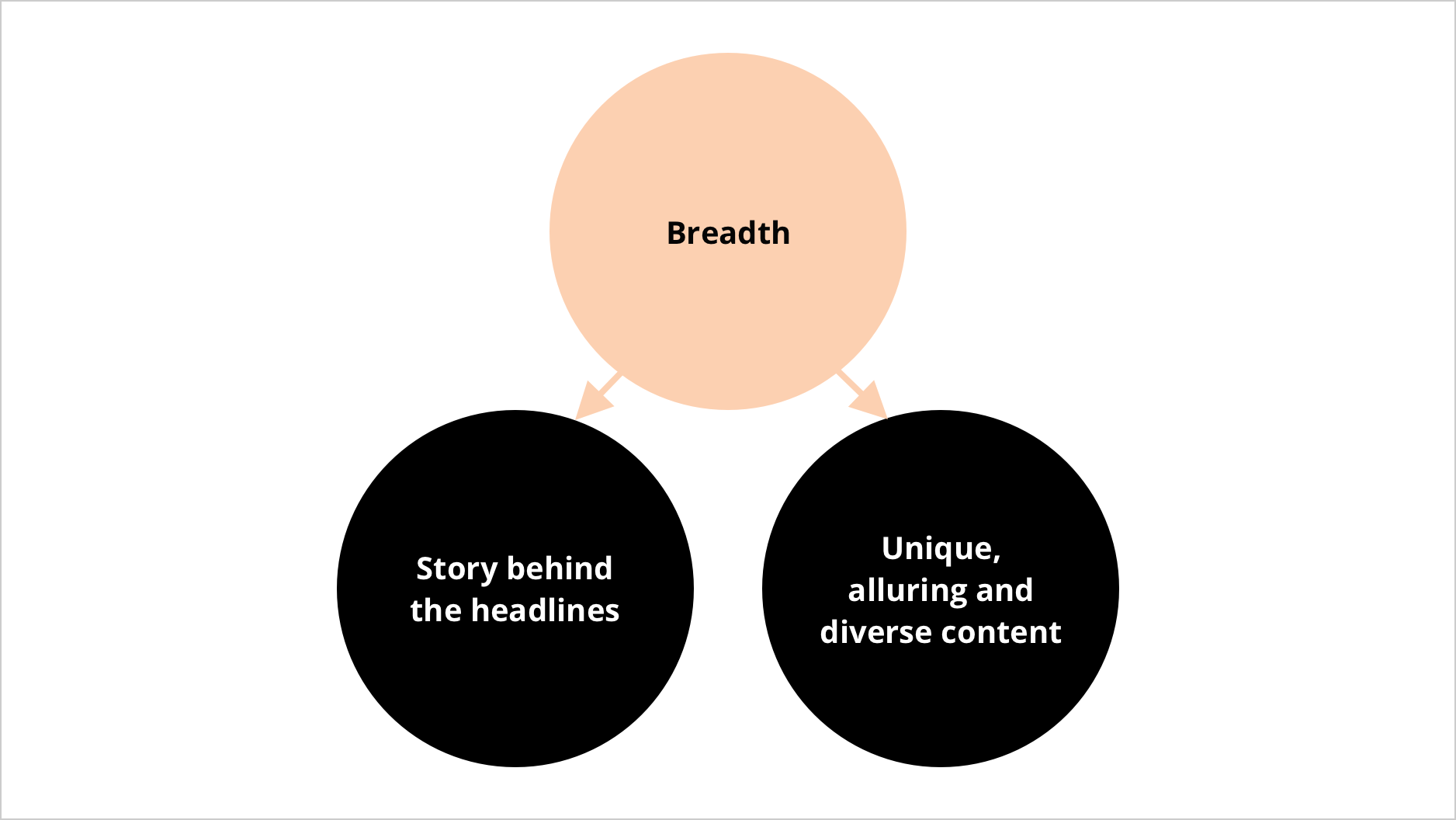
While most felt the old homepage did a good job at keeping them up to date with today’s headlines, the most valued yet least well served jobs for the homepage was digging deeper into a story and finding unique alluring and diverse content.
‘Opinion pieces are good - if it had my vote, they would be more prominent’
‘I ignore the headlines at the top. I consume so much news, I have an opinion. The homepage needs to give me an angle I have not seen before which is valid’
‘I’d like to see articles which are quite unique, not just news’
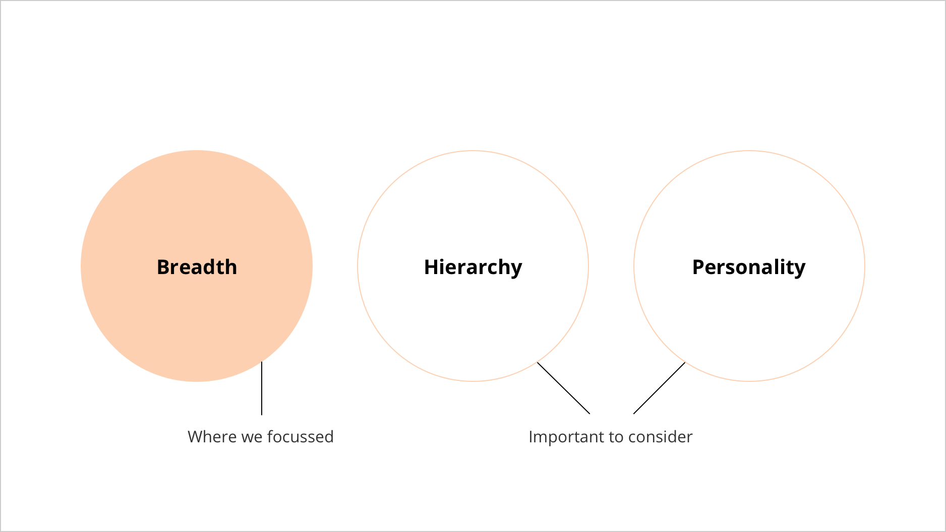
Editorial Jobs to be Done
Interviewing editors also revealed 3 clear Jobs to be Done from their perspective:
![]()
Editors should be able to present the breadth of the FT in an appropriate hierarchy that aligns with a given day's agenda. In doing so, they showcase the FTs personality. There was room for improvement in all of these.
‘Throughout the news cycle we want to show our breadth; of topics, formats, genres, and opinions so that our readers are aware of the variety and wealth of content we create’
Alignment
Having discovered both reader and editorial JTBD, we attempted to piece them together, looking for alignments, overlaps and synergy. A theme and opportunity around breadth emerged.
![]()
Ideation
Armed with all the research and understanding, I led three ideation workshops with our team and stakeholders.
The goal was to generate as many ideas that inspire broader reading from the homepage.
At the end of the week we had 50 ideas and voted on our favourites.
The goal was to generate as many ideas that inspire broader reading from the homepage.
At the end of the week we had 50 ideas and voted on our favourites.


Paper Prototyping
To test the value of our best ideas quickly, I sketched 8 paper prototypes and tested them with 8 subscribers. Because they were low-fidelity people focused on the core value of the concept, rather than their usability.
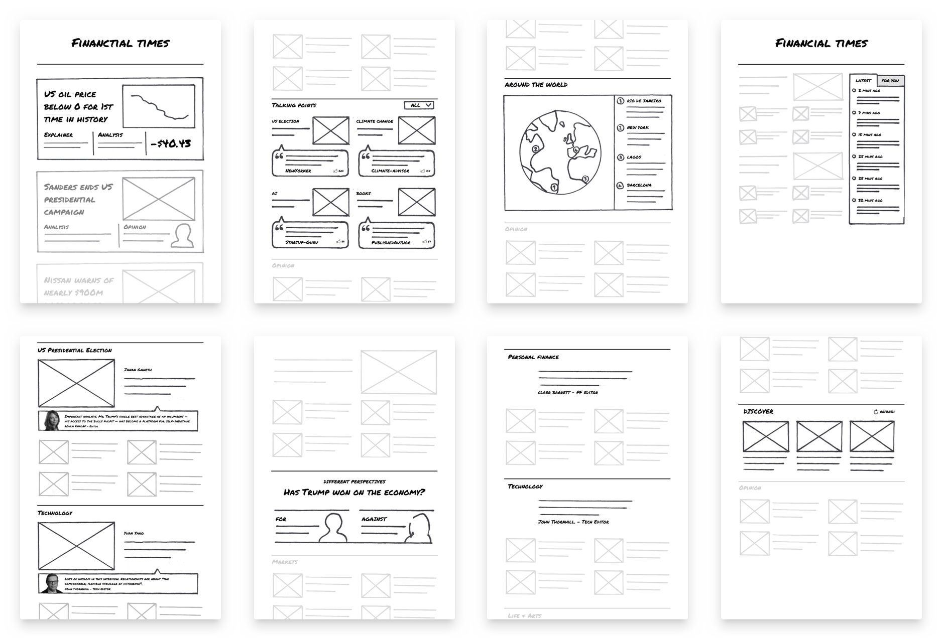
Favourites quickly emerged: ‘Story Grouping’, ‘Talking Points’ and ‘Around the World’.
Testing & Experimentation
We transformed these popular concepts into higher-fidelity prototypes to assess how they work alongside more obvious parts of the UI and to test usability
This round of testing was also a chance for use to experiment with the UI and layout of the page. We used spectrums with relevant variables - like ‘newspaper inspired’ vs. ‘social media inspired’ - to help push the designs in contrasting and sometimes uncomfortable directions.
![Homepage inspired by social media feeds]()
This round of testing was also a chance for use to experiment with the UI and layout of the page. We used spectrums with relevant variables - like ‘newspaper inspired’ vs. ‘social media inspired’ - to help push the designs in contrasting and sometimes uncomfortable directions.

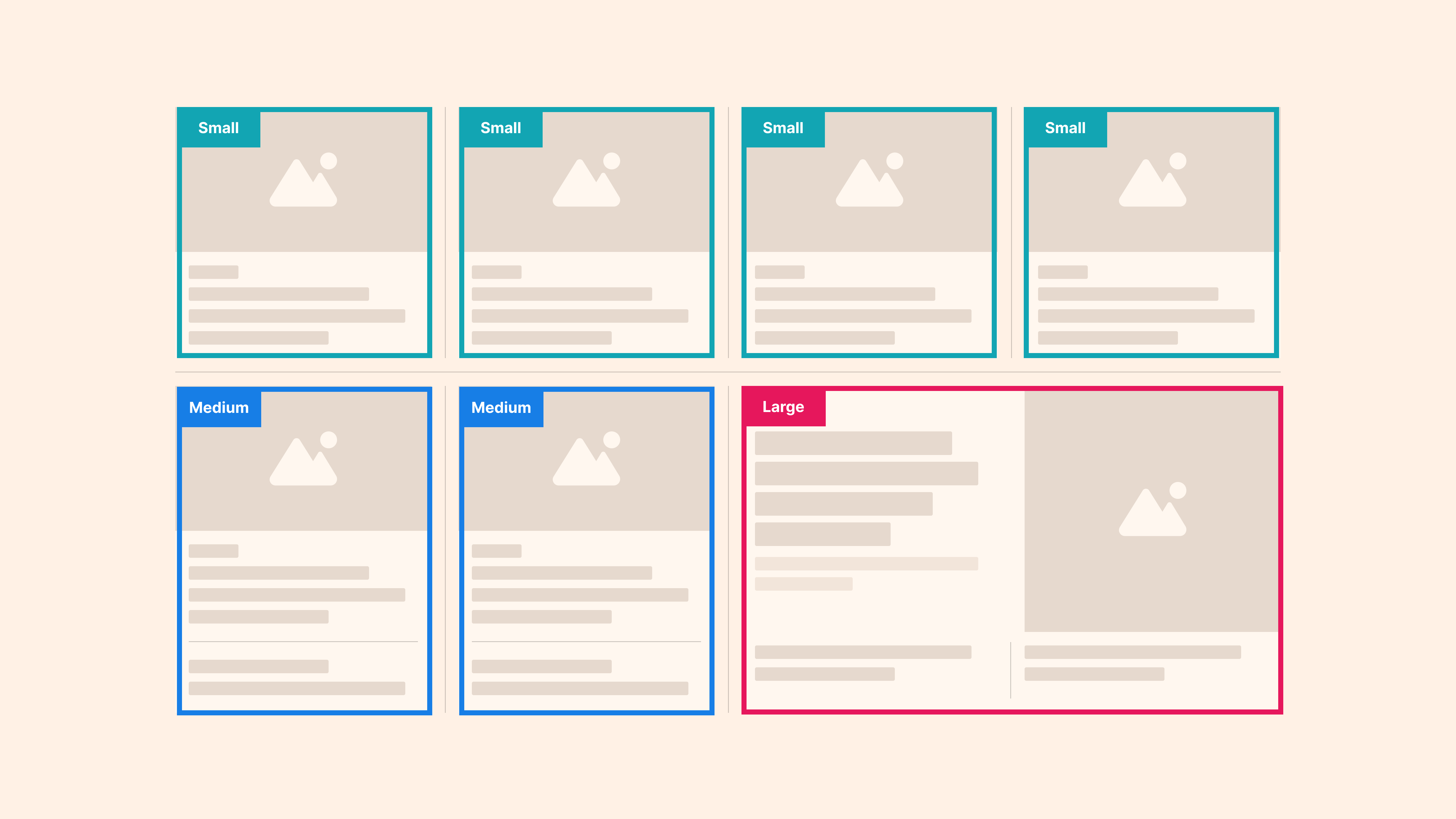
Story Groups
Story groups continued to test well with users and became the backbone of the new homepage. It allows editors to group up to 5 articles about the same story together and place them anywhere on the homepage, giving editorial control and maximum flexibility.


Crafting th UI
Should the homepage look more like a newspaper or a digital product?
Many FT subscribers state that they enjoy the look, feel and experience of the physical newspaper. However, it’s important that the FT fits in with the digital products people use alongside. The UI purposefully embraces both worlds:
Many FT subscribers state that they enjoy the look, feel and experience of the physical newspaper. However, it’s important that the FT fits in with the digital products people use alongside. The UI purposefully embraces both worlds:


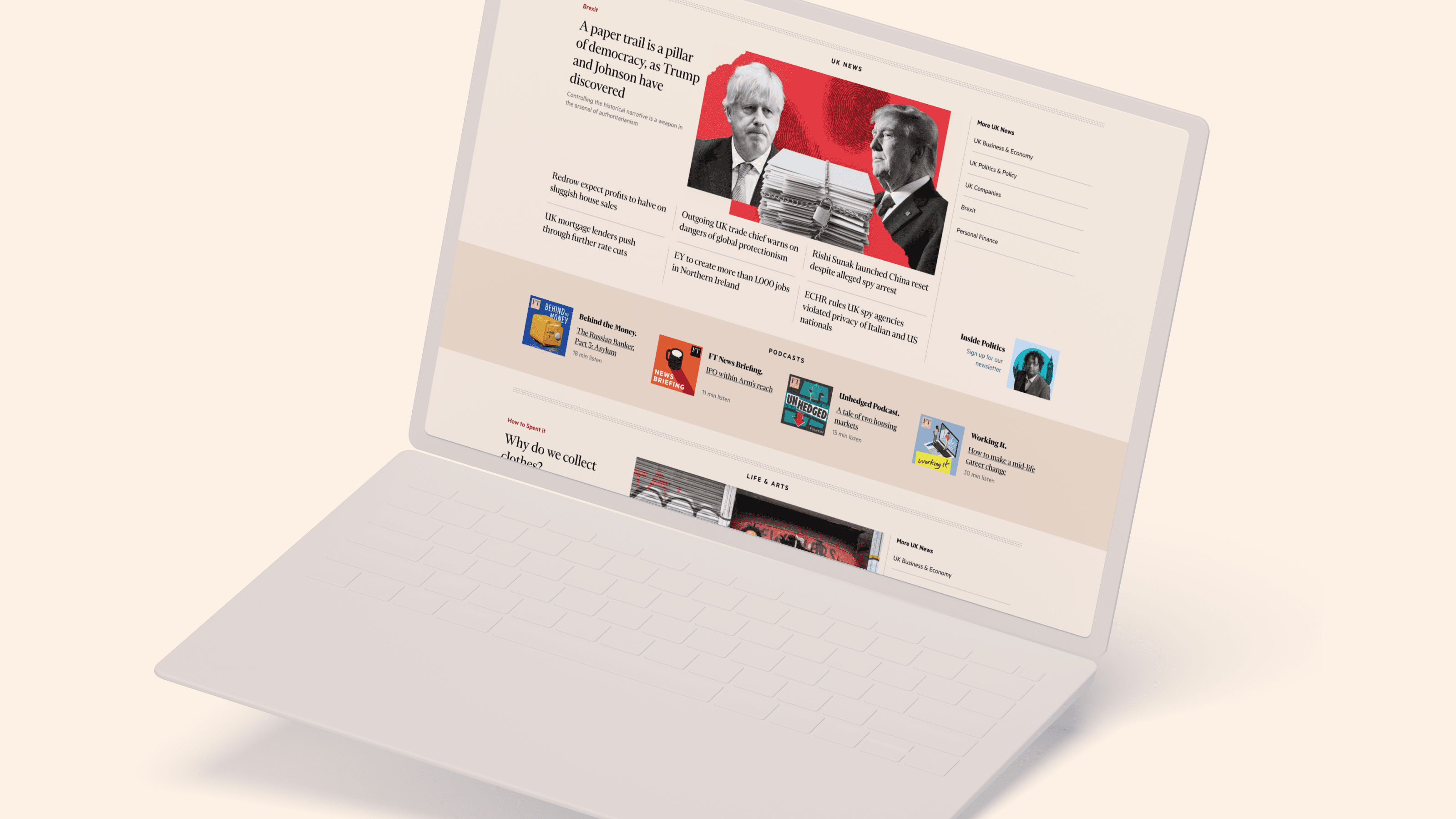
The use of story cards take inspiration from Google’s Material Design and the page is littered with live media content like podcasts and videos throughout the page. The heading typography is simple, limited and practical and the layout and placement is purposefully separated from the journalism, but in a way that frames it.
In contrast, the content UI is rooted in the newspaper's heritage. The journalism is broken up into sections and placed on an a pink backdrop, giving a nod to the pink pages that the FT is famed for. Much of the typography mirrors the print edition, with a serifed font taking center stage. The structure of the page is marked by horizontal and vertical lines, creating a grid-like feel common in print newspapers.
Together, the UI looks forward, feeling a digital product of today, but remains rooted in its newspaper heritage.
Further Reading
A new homepage for FT readers
FT Product & Tech Blog Read NextSupporting international bodies in mediating conflict
FT Product & Tech Blog Read Next